Toast
A Toast component displays transient notifications. Uses heroui-native useToast hook for showing toast messages.
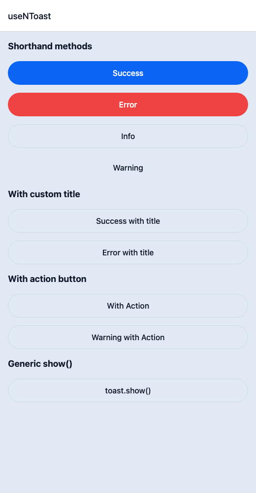
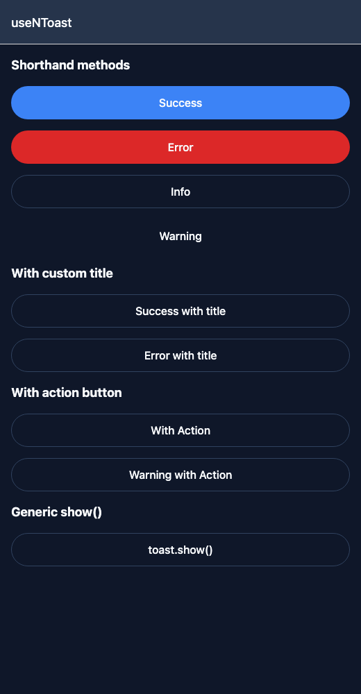
React Native components render to native views, so this is the component running in the example app, in the theme you are reading in.
9:41
Toast.tsx
import { View } from 'react-native';import { NButton, NText, useNToast } from '@nayan-ui/native';export default function ToastScreen() {const toast = useNToast();return (<View className="p-4 gap-4"><NText className="text-lg font-bold">Shorthand methods</NText><NButton onPress={() => toast.success('Changes saved successfully!')}>Success</NButton><NButton variant="danger" onPress={() => toast.error('Something went wrong.')}>Error</NButton><NButton variant="outline" onPress={() => toast.info('New update available.')}>Info</NButton><NButton variant="ghost" onPress={() => toast.warning('Low disk space.')}>Warning</NButton><NText className="text-lg font-bold">With custom title</NText><NButton variant="outline" onPress={() => toast.success('Your profile has been updated.', 'Profile')}>Success with title</NButton><NButton variant="outline" onPress={() => toast.error('Please check your connection.', 'Network')}>Error with title</NButton><NText className="text-lg font-bold">With action button</NText><NButtonvariant="outline"onPress={() =>toast.show({type: 'success',title: 'Item deleted',message: 'The item has been moved to trash.',actionLabel: 'Undo',onActionPress: () => toast.info('Undo successful!')})}>With Action</NButton><NButtonvariant="outline"onPress={() =>toast.show({type: 'warning',title: 'Session expiring',message: 'Your session will expire in 5 minutes.',actionLabel: 'Extend',onActionPress: () => toast.success('Session extended!')})}>Warning with Action</NButton><NText className="text-lg font-bold">Generic show()</NText><NButton variant="outline" onPress={() => toast.show({ type: 'info', title: 'Custom', message: 'Using toast.show() directly.' })}>toast.show()</NButton></View>);}
| Name | Type | Default | Details |
|---|---|---|---|
| useNToast() | Hook | Returns toast methods: show, success, error, info, warning. | |
| show(options) | NToastShowOptions | Show a toast with type, message, title, icon, actionLabel, onActionPress. | |
| success(message, title?, icon?) | method | Show a success toast. | |
| error(message, title?, icon?) | method | Show an error toast. | |
| info(message, title?, icon?) | method | Show an info toast. | |
| warning(message, title?, icon?) | method | Show a warning toast. |
Other components solving nearby problems.
- React Native Toast
- React Native Notification
- React Native Toast Message
- Mobile Toast React Native
- React Native Toast Component
- React Native Toast Library
- React Native Snackbar
- React Native Flash Message
- React Native Popup Toast
- React Native Success Toast
- React Native Error Toast
- React Native Info Toast
- Mobile Toast Component
- Cross Platform Toast
- Expo Toast Component
- React Native Toast Tutorial
- React Native Toast TypeScript
- React Native Toast UI