Divider
A Divider component separates content within a layout. Built on top of heroui-native Separator.
React Native components render to native views, so this is the component running in the example app, in the theme you are reading in.
9:41
Divider.tsx
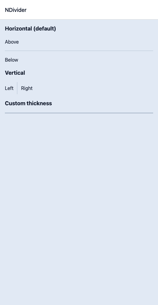
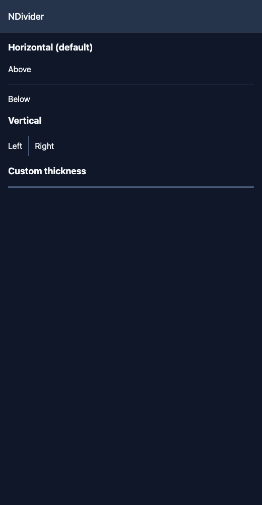
import { View } from 'react-native';import { NDivider, NText } from '@nayan-ui/native';export default function DividerScreen() {return (<View className="p-4 gap-4"><NText className="text-lg font-bold">Horizontal (default)</NText><NText>Above</NText><NDivider /><NText>Below</NText><NText className="text-lg font-bold">Vertical</NText><View className="flex-row items-center gap-3 h-10"><NText>Left</NText><NDivider orientation="vertical" /><NText>Right</NText></View><NText className="text-lg font-bold">Custom thickness</NText><NDivider thickness={3} /></View>);}
| Name | Type | Default | Details |
|---|---|---|---|
| className | string | ' ' | You can customise by passing tailwind classes. |
| orientation | vertical | horizontal | horizontal | You can pass divider orientation. |
Other components solving nearby problems.
- React Native Divider
- React Native Separator
- React Native Line Divider
- Mobile Divider React Native
- React Native Divider Component
- React Native Divider Library
- React Native Horizontal Divider
- React Native Vertical Divider
- React Native Section Divider
- React Native Content Separator
- React Native List Divider
- React Native Border Divider
- Mobile Separator Component
- Cross Platform Divider
- Expo Divider Component
- React Native Divider Tutorial
- React Native Divider TypeScript
- React Native Divider UI