Dropdown Menu
A Dropdown Menu component displays a list of options when triggered. Built on top of heroui-native Menu.
React Native components render to native views, so this is the component running in the example app, in the theme you are reading in.
9:41
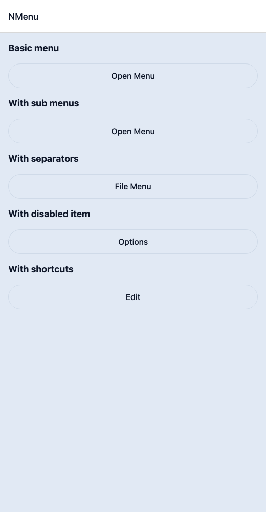
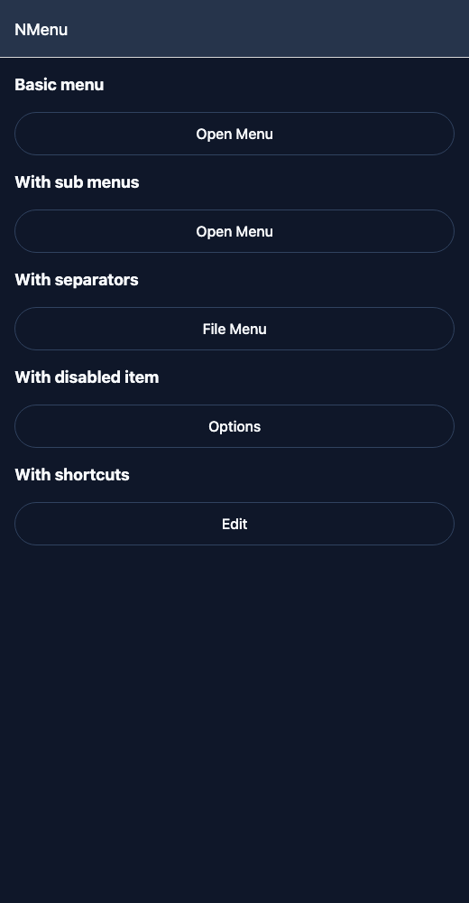
DropdownMenu.tsx
import { View } from 'react-native';import { Ionicons } from '@expo/vector-icons';import { NButton, NMenu, NMenuItem, NSubMenu, NText } from '@nayan-ui/native';export default function MenuScreen() {return (<View className="p-4 gap-4"><NText className="text-lg font-bold">Basic menu</NText><NMenu trigger={<NButton variant="outline">Open Menu</NButton>} title="Actions"><NMenuItem title="Edit" icon={<Ionicons name="create-outline" size={16} />} onPress={() => console.log('Edit')} /><NMenuItem title="Duplicate" icon={<Ionicons name="copy-outline" size={16} />} onPress={() => console.log('Duplicate')} /><NMenuItem title="Archive" icon={<Ionicons name="archive-outline" size={16} />} onPress={() => console.log('Archive')} /></NMenu><NText className="text-lg font-bold">With sub menus</NText><NMenu trigger={<NButton variant="outline">Open Menu</NButton>}><NMenuItem title="New File" icon={<Ionicons name="document-outline" size={16} />} onPress={() => {}} /><NMenuItem title="Open" icon={<Ionicons name="folder-open-outline" size={16} />} onPress={() => {}} /><NSubMenu label="Share" icon={<Ionicons name="share-outline" size={16} />}><NMenuItem title="Email" icon={<Ionicons name="mail-outline" size={16} />} onPress={() => {}} /><NMenuItem title="Message" icon={<Ionicons name="chatbubble-outline" size={16} />} onPress={() => {}} /><NMenuItem title="AirDrop" icon={<Ionicons name="wifi-outline" size={16} />} onPress={() => {}} /></NSubMenu><NSubMenu label="Export As" icon={<Ionicons name="download-outline" size={16} />}><NMenuItem title="PDF" icon={<Ionicons name="document-text-outline" size={16} />} onPress={() => {}} /><NMenuItem title="PNG" icon={<Ionicons name="image-outline" size={16} />} onPress={() => {}} /><NMenuItem title="SVG" icon={<Ionicons name="code-outline" size={16} />} onPress={() => {}} /></NSubMenu></NMenu><NText className="text-lg font-bold">With separators</NText><NMenu trigger={<NButton variant="outline">File Menu</NButton>}><NMenuItem title="New" icon={<Ionicons name="add-circle-outline" size={16} />} onPress={() => {}} /><NMenuItem title="Open" icon={<Ionicons name="folder-open-outline" size={16} />} onPress={() => {}} /><NMenuItem title="Save" icon={<Ionicons name="save-outline" size={16} />} onPress={() => {}} hasSeparator /><NMenuItem title="Delete" icon={<Ionicons name="trash-outline" size={16} />} onPress={() => {}} /></NMenu><NText className="text-lg font-bold">With disabled item</NText><NMenu trigger={<NButton variant="outline">Options</NButton>}><NMenuItem title="Available" icon={<Ionicons name="checkmark-circle-outline" size={16} />} onPress={() => {}} /><NMenuItem title="Locked" icon={<Ionicons name="lock-closed-outline" size={16} />} onPress={() => {}} isDisabled /></NMenu><NText className="text-lg font-bold">With shortcuts</NText><NMenu trigger={<NButton variant="outline">Edit</NButton>}><NMenuItem title="Cut" icon={<Ionicons name="cut-outline" size={16} />} shortcut="⌘X" onPress={() => {}} /><NMenuItem title="Copy" icon={<Ionicons name="copy-outline" size={16} />} shortcut="⌘C" onPress={() => {}} /><NMenuItem title="Paste" icon={<Ionicons name="clipboard-outline" size={16} />} shortcut="⌘V" onPress={() => {}} /></NMenu></View>);}
| Name | Type | Default | Details |
|---|---|---|---|
| trigger | React.ReactNode | Required | Trigger element for the menu. |
| children | React.ReactNode | Optional | Menu content (NMenuItem, NSubMenu items). |
| title | string | Optional | Title label shown at the top of the menu. |
| width | number | 220 | Width of the menu content. |
| className | string | ' ' | You can customise by passing tailwind classes. |
| titleClassName | string | ' ' | You can customise title by passing tailwind classes. |
Other components solving nearby problems.
- React Native Menu
- React Native Dropdown Menu
- React Native Context Menu
- Mobile Menu React Native
- React Native Menu Component
- React Native Menu Library
- React Native Popup Menu
- React Native Action Menu
- React Native Options Menu
- React Native Navigation Menu
- React Native Hamburger Menu
- React Native Side Menu
- React Native Drawer Menu
- Mobile Menu Component
- Cross Platform Menu
- Expo Menu Component
- React Native Menu Tutorial
- React Native Menu TypeScript
- React Native Menu UI