Select
A Select component allows users to choose from a dropdown list. Built on top of heroui-native Select.
React Native components render to native views, so this is the component running in the example app, in the theme you are reading in.
9:41
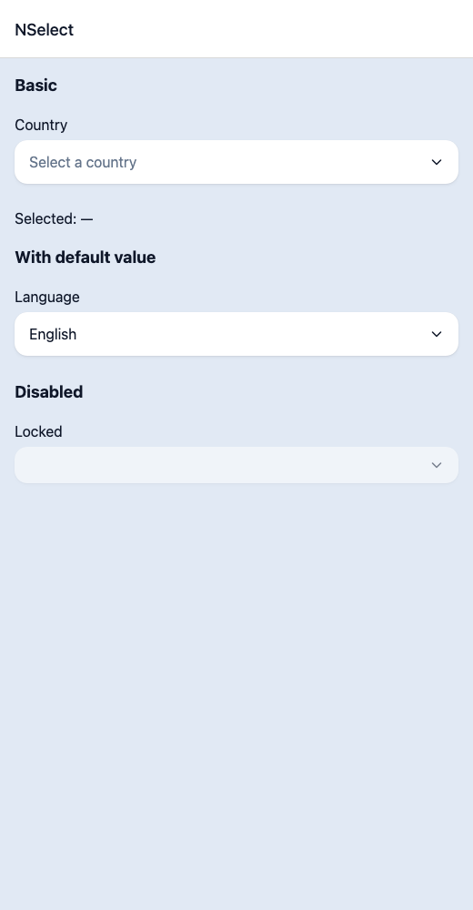
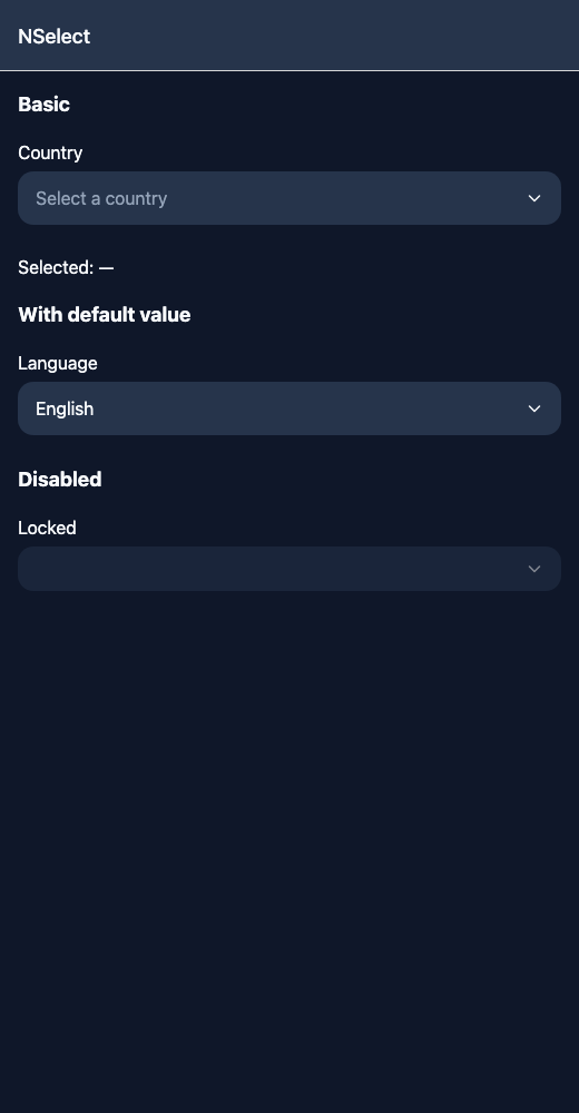
Select.tsx
import { View } from 'react-native';import { useState } from 'react';import { NSelect, NText } from '@nayan-ui/native';export default function SelectScreen() {const [country, setCountry] = useState('');return (<View className="p-4 gap-4"><NText className="text-lg font-bold">Basic</NText><NSelectlabel="Country"placeholder="Select a country"items={[{ label: 'India', value: 'in' },{ label: 'USA', value: 'us' },{ label: 'UK', value: 'uk' },{ label: 'Germany', value: 'de' },{ label: 'Japan', value: 'jp' }]}onValueChange={setCountry}/><NText>Selected: {country || '—'}</NText><NText className="text-lg font-bold">With default value</NText><NSelectlabel="Language"defaultValue={{ label: 'English', value: 'en' }}items={[{ label: 'English', value: 'en' },{ label: 'Spanish', value: 'es' },{ label: 'French', value: 'fr' }]}onValueChange={() => {}}/><NText className="text-lg font-bold">Disabled</NText><NSelect label="Locked" isDisabled items={[{ label: 'Only option', value: 'only' }]} onValueChange={() => {}} /></View>);}
| Name | Type | Default | Details |
|---|---|---|---|
| items | SelectOption[] | Required | Array of select options with label and value. |
| onValueChange | (value: string) => void | Required | Callback when selection changes (returns the value string). |
| label | string | Optional | Label above the select. |
| selectLabel | string | Optional | Label shown inside the dropdown list. |
| placeholder | string | Optional | Placeholder text for the select trigger. |
| defaultValue | SelectOption | Optional | Default selected option. |
| isDisabled | boolean | false | Whether the select is disabled. |
| containerClassName | string | ' ' | You can customise container by passing tailwind classes. |
| labelClassName | string | ' ' | You can customise label by passing tailwind classes. |
| triggerClassName | string | ' ' | You can customise trigger by passing tailwind classes. |
| disabled | boolean | false | Alias of isDisabled. |
| value | SelectOption | Optional | Controlled selected option. |
| options | SelectOption[] | Optional | Alias of items. |
| onChange | (value: string) => void | Optional | Alias of onValueChange. |
Other components solving nearby problems.
- React Native Select
- React Native Picker
- React Native Dropdown Select
- Mobile Select React Native
- React Native Select Component
- React Native Select Library
- React Native Dropdown
- React Native Picker Select
- React Native Option Picker
- React Native Form Select
- React Native Multi Select
- React Native Searchable Select
- React Native Choice Select
- Mobile Select Component
- Cross Platform Select
- Expo Select Component
- React Native Select Tutorial
- React Native Select TypeScript
- React Native Select UI