Skeleton
A Skeleton component is a placeholder UI element that represents the layout of content before it loads. Built on top of heroui-native Skeleton.
React Native components render to native views, so this is the component running in the example app, in the theme you are reading in.
9:41
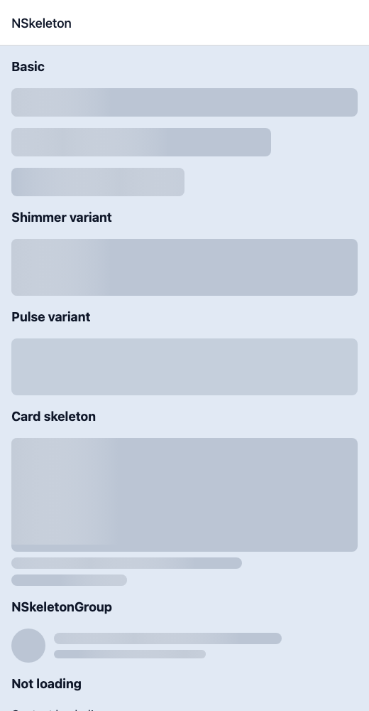
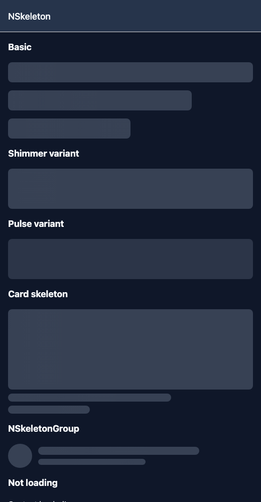
Skeleton.tsx
import { View } from 'react-native';import { NSkeleton, NSkeletonGroup, NText } from '@nayan-ui/native';export default function SkeletonScreen() {return (<View className="p-4 gap-4"><NText className="text-lg font-bold">Basic</NText><NSkeleton className="h-10 w-full rounded" isLoading /><NSkeleton className="h-10 w-3/4 rounded" isLoading /><NSkeleton className="h-10 w-1/2 rounded" isLoading /><NText className="text-lg font-bold">Shimmer variant</NText><NSkeleton className="h-20 w-full rounded-lg" isLoading variant="shimmer" /><NText className="text-lg font-bold">Pulse variant</NText><NSkeleton className="h-20 w-full rounded-lg" isLoading variant="pulse" /><NText className="text-lg font-bold">Card skeleton</NText><View className="gap-2"><NSkeleton className="h-40 w-full rounded-lg" isLoading /><NSkeleton className="h-4 w-2/3 rounded" isLoading /><NSkeleton className="h-4 w-1/3 rounded" isLoading /></View><NText className="text-lg font-bold">NSkeletonGroup</NText><NSkeletonGroup isLoading><View className="flex-row gap-3 items-center"><NSkeleton className="h-12 w-12 rounded-full" /><View className="flex-1 gap-2"><NSkeleton className="h-4 w-3/4 rounded" /><NSkeleton className="h-3 w-1/2 rounded" /></View></View></NSkeletonGroup><NText className="text-lg font-bold">Not loading</NText><NSkeleton className="h-10 w-full rounded" isLoading={false}><NText>Content loaded!</NText></NSkeleton></View>);}
| Name | Type | Default | Details |
|---|---|---|---|
| className | string | ' ' | You can customise by passing tailwind classes. |
Other components solving nearby problems.
- React Native Skeleton
- React Native Skeleton Loader
- React Native Loading Skeleton
- Mobile Skeleton React Native
- React Native Skeleton Component
- React Native Skeleton Library
- React Native Skeleton Placeholder
- React Native Shimmer Skeleton
- React Native Content Loader
- React Native Loading Placeholder
- React Native Skeleton Screen
- React Native Ghost Loading
- Mobile Skeleton Component
- Cross Platform Skeleton
- Expo Skeleton Component
- React Native Skeleton Tutorial
- React Native Skeleton TypeScript
- React Native Skeleton UI