Button
A Button component triggers actions or events. Built on top of heroui-native Button with support for variants, sizes, colors, and loading states.
React Native components render to native views, so this is the component running in the example app, in the theme you are reading in.
9:41
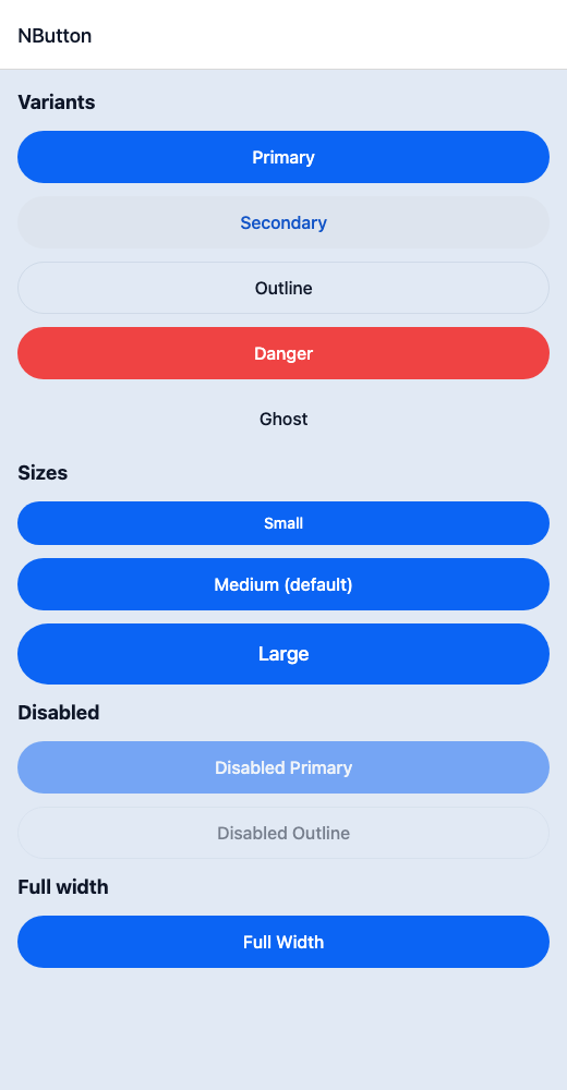
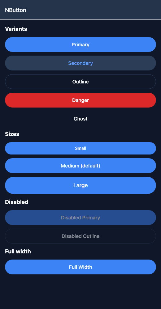
Button.tsx
import { View } from 'react-native';import { NButton, NText } from '@nayan-ui/native';export default function ButtonScreen() {return (<View className="p-4 gap-3"><NText className="text-lg font-bold">Variants</NText><NButton variant="primary" onPress={() => {}}>Primary</NButton><NButton variant="secondary" onPress={() => {}}>Secondary</NButton><NButton variant="outline" onPress={() => {}}>Outline</NButton><NButton variant="danger" onPress={() => {}}>Danger</NButton><NButton variant="ghost" onPress={() => {}}>Ghost</NButton><NText className="text-lg font-bold">Sizes</NText><NButton size="sm" onPress={() => {}}>Small</NButton><NButton size="md" onPress={() => {}}>Medium (default)</NButton><NButton size="lg" onPress={() => {}}>Large</NButton><NText className="text-lg font-bold">Disabled</NText><NButton isDisabled onPress={() => {}}>Disabled Primary</NButton><NButton variant="outline" isDisabled onPress={() => {}}>Disabled Outline</NButton><NText className="text-lg font-bold">Full width</NText><NButton className="w-full" onPress={() => {}}>Full Width</NButton></View>);}
| Name | Type | Default | Details |
|---|---|---|---|
| children | React.ReactNode | Required | Button label content. |
| icon | React.ComponentType<any> | React.ReactElement | Optional | Icon component or element to display. |
| variant | 'primary' | 'secondary' | 'outline' | 'ghost' | 'link' | 'primary' | Button variant style. |
| size | 'sm' | 'md' | 'lg' | 'md' | Button size. |
| isDisabled | boolean | false | Whether the button is disabled. |
| onPress | () => void | Optional | Callback when button is pressed. |
| className | string | ' ' | You can customise by passing tailwind classes. |
Other components solving nearby problems.
- React Native Button
- React Native Touchable
- React Native Pressable
- React Native Custom Button
- Mobile Button React Native
- React Native Button Component
- React Native Button Library
- React Native TouchableOpacity
- React Native TouchableHighlight
- React Native Button Styles
- React Native Button Animation
- React Native Button with Icon
- React Native Floating Button
- React Native FAB Button
- Mobile Button Component
- Cross Platform Button
- Expo Button Component
- React Native Button Tutorial
- React Native Button TypeScript
- React Native Button UI