Sheet
A Sheet component presents content in a sliding bottom panel. Built on top of heroui-native Sheet.
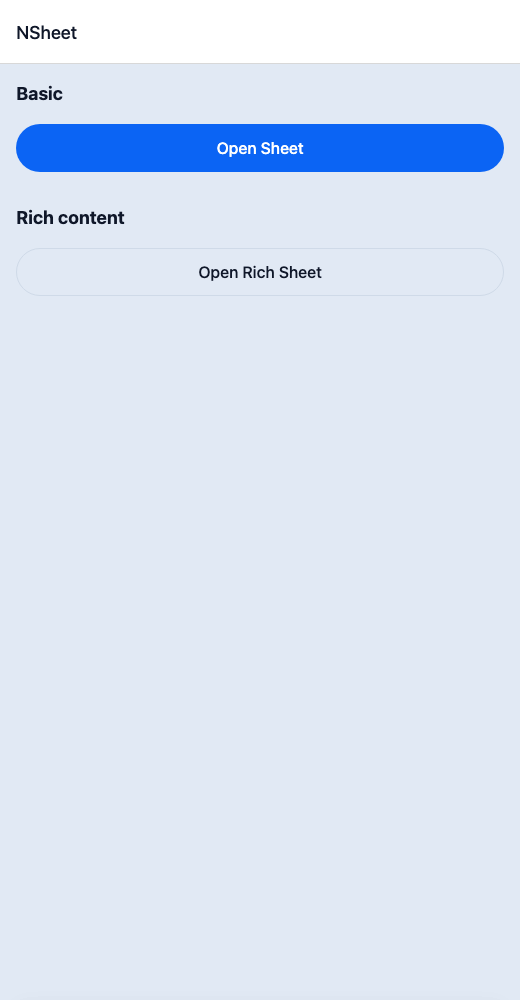
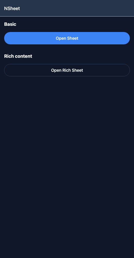
React Native components render to native views, so this is the component running in the example app, in the theme you are reading in.
9:41
Sheet.tsx
import { useState } from 'react';import { View } from 'react-native';import { NButton, NSheet, NText } from '@nayan-ui/native';export default function SheetScreen() {const [basic, setBasic] = useState(false);const [content, setContent] = useState(false);return (<View className="p-4 gap-4"><NText className="text-lg font-bold">Basic</NText><NButton onPress={() => setBasic(true)}>Open Sheet</NButton><NSheet isOpen={basic} onOpenChange={setBasic}><View className="p-4"><NText className="text-lg font-bold mb-2">Bottom Sheet</NText><NText>Simple sheet content.</NText><NButton className="mt-4" variant="outline" onPress={() => setBasic(false)}>Close</NButton></View></NSheet><NText className="text-lg font-bold">Rich content</NText><NButton variant="outline" onPress={() => setContent(true)}>Open Rich Sheet</NButton><NSheet isOpen={content} onOpenChange={setContent}><View className="p-4 gap-3"><NText className="text-xl font-bold">Settings</NText><NText className="text-muted">Adjust your preferences below.</NText><NButton onPress={() => setContent(false)}>Save</NButton><NButton variant="ghost" onPress={() => setContent(false)}>Cancel</NButton></View></NSheet></View>);}
| Name | Type | Default | Details |
|---|---|---|---|
| children | React.ReactNode | Required | Content for the sheet. |
| trigger | React.ReactNode | Optional | Trigger element to open the sheet. |
| title | string | Optional | Title shown at the top of the sheet. |
| description | string | Optional | Description text below the title. |
| isOpen | boolean | Optional | Controlled open state. |
| isDefaultOpen | boolean | Optional | Default open state for uncontrolled usage. |
| onOpenChange | (isOpen: boolean) => void | Optional | Callback when open state changes. |
| className | string | ' ' | You can customise content by passing tailwind classes. |
| titleClassName | string | ' ' | You can customise title by passing tailwind classes. |
| descriptionClassName | string | ' ' | You can customise description by passing tailwind classes. |
| snapPoints | (string | number)[] | Optional | Array of snap points for the bottom sheet. |
Other components solving nearby problems.
- React Native Sheet
- React Native Bottom Sheet
- React Native Modal Sheet
- Mobile Sheet React Native
- React Native Sheet Component
- React Native Sheet Library
- React Native Action Sheet
- React Native Slide Up Panel
- React Native Drawer Sheet
- React Native Swipe Sheet
- React Native Snap Sheet
- React Native Pull Up Sheet
- Mobile Sheet Component
- Cross Platform Sheet
- Expo Sheet Component
- React Native Sheet Tutorial
- React Native Sheet TypeScript
- React Native Sheet UI