Popover
A Popover component displays additional information in a floating overlay. Built on top of heroui-native Popover.
React Native components render to native views, so this is the component running in the example app, in the theme you are reading in.
9:41
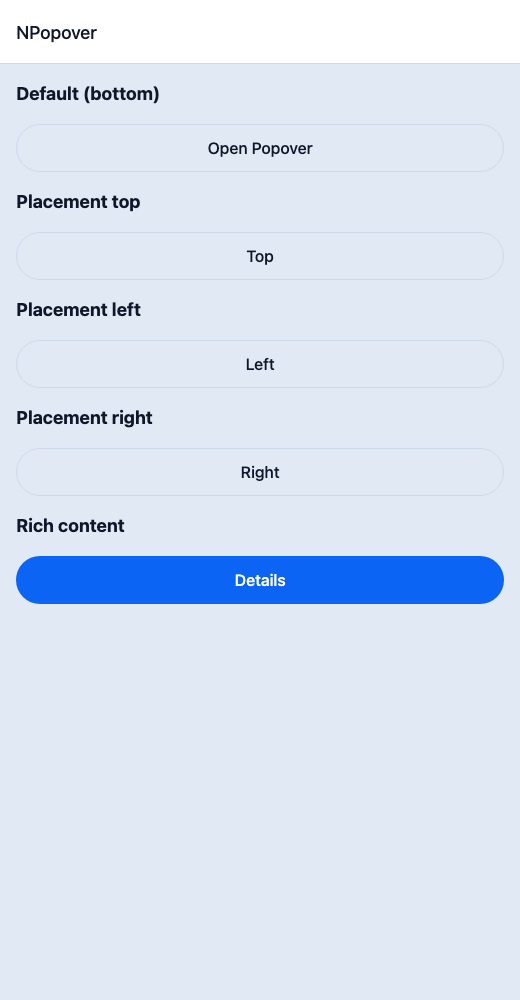
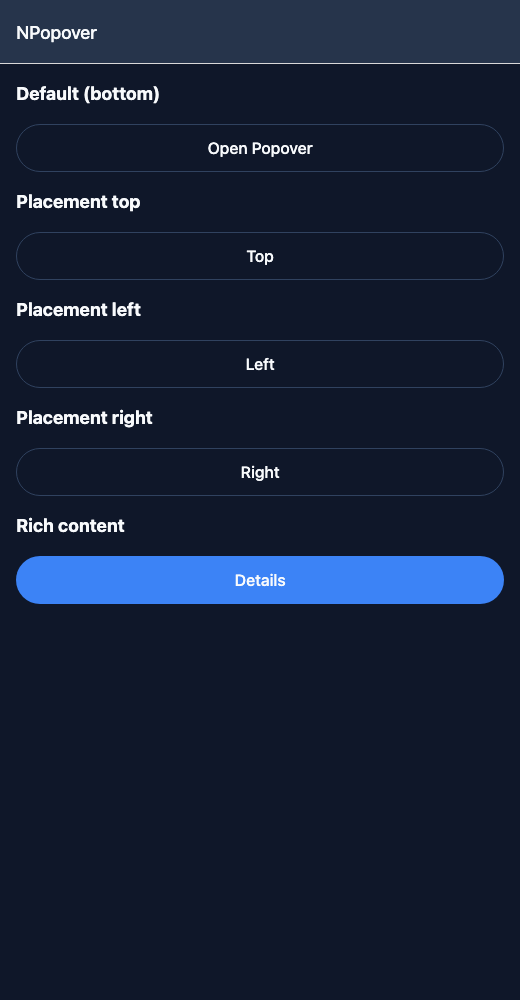
Popover.tsx
import { View } from 'react-native';import { NButton, NPopover, NText } from '@nayan-ui/native';export default function PopoverScreen() {return (<View className="p-4 gap-4"><NText className="text-lg font-bold">Default (bottom)</NText><NPopover trigger={<NButton variant="outline">Open Popover</NButton>}><View className="p-3"><NText>Popover content below the trigger.</NText></View></NPopover><NText className="text-lg font-bold">Placement top</NText><NPopover placement="top" trigger={<NButton variant="outline">Top</NButton>}><View className="p-3"><NText>Above the trigger.</NText></View></NPopover><NText className="text-lg font-bold">Placement left</NText><NPopover placement="left" trigger={<NButton variant="outline">Left</NButton>}><View className="p-3"><NText>Left side.</NText></View></NPopover><NText className="text-lg font-bold">Placement right</NText><NPopover placement="right" trigger={<NButton variant="outline">Right</NButton>}><View className="p-3"><NText>Right side.</NText></View></NPopover><NText className="text-lg font-bold">Rich content</NText><NPopover trigger={<NButton>Details</NButton>}><View className="p-3 gap-2"><NText className="font-bold">User Info</NText><NText className="text-muted">john@example.com</NText><NButton size="sm" onPress={() => {}}>View Profile</NButton></View></NPopover></View>);}
| Name | Type | Default | Details |
|---|---|---|---|
| trigger | React.ReactNode | Optional | Trigger element for the popover. |
| children | React.ReactNode | Required | Content for the popover. |
| isOpen | boolean | Optional | Controlled open state. |
| onOpenChange | (isOpen: boolean) => void | Optional | Callback when open state changes. |
| placement | 'top' | 'bottom' | 'left' | 'right' | 'bottom' | Placement of the popover. |
| className | string | ' ' | You can customise by passing tailwind classes. |
Other components solving nearby problems.
- React Native Popover
- React Native Tooltip Menu
- React Native Popup Menu
- Mobile Popover React Native
- React Native Popover Component
- React Native Popover Library
- React Native Dropdown Popover
- React Native Tooltip Popover
- React Native Context Popover
- React Native Action Popover
- React Native Overlay Popover
- React Native Info Popover
- Mobile Popover Component
- Cross Platform Popover
- Expo Popover Component
- React Native Popover Tutorial
- React Native Popover TypeScript
- React Native Popover UI