Alert
An Alert component displays important messages or notifications to users with different severity levels. Built on top of heroui-native.
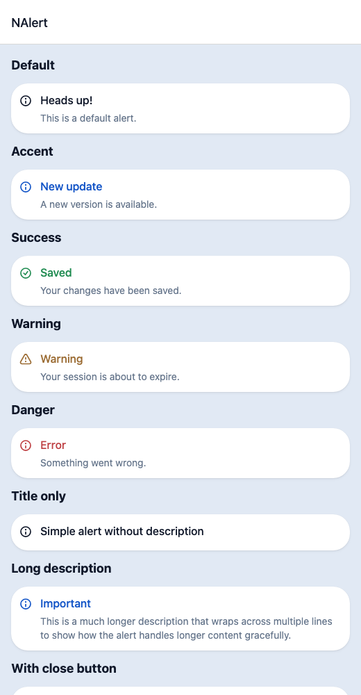
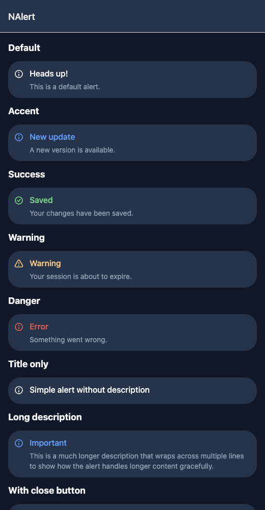
React Native components render to native views, so this is the component running in the example app, in the theme you are reading in.
9:41
Alert.tsx
import { View } from 'react-native';import { NAlert, NText } from '@nayan-ui/native';export default function AlertScreen() {return (<View className="p-4 gap-3"><NText className="text-lg font-bold">Default</NText><NAlert title="Heads up!" description="This is a default alert." /><NText className="text-lg font-bold">Accent</NText><NAlert status="accent" title="New update" description="A new version is available." /><NText className="text-lg font-bold">Success</NText><NAlert status="success" title="Saved" description="Your changes have been saved." /><NText className="text-lg font-bold">Warning</NText><NAlert status="warning" title="Warning" description="Your session is about to expire." /><NText className="text-lg font-bold">Danger</NText><NAlert status="danger" title="Error" description="Something went wrong." /><NText className="text-lg font-bold">Title only</NText><NAlert title="Simple alert without description" /><NText className="text-lg font-bold">Long description</NText><NAlertstatus="accent"title="Important"description="This is a much longer description that wraps across multiple lines to show how the alert handles longer content gracefully."/><NText className="text-lg font-bold">With close button</NText><NAlert status="accent" title="Dismissible" description="Tap the close button to dismiss." onClose={() => console.log('closed')} /><NAlert status="success" title="Upload complete" description="Your file has been uploaded." onClose={() => console.log('closed')} /><NAlert status="warning" title="Low storage" description="You are running low on storage." onClose={() => console.log('closed')} /></View>);}
| Name | Type | Default | Details |
|---|---|---|---|
| title | string | Optional | Title for the alert. |
| description | string | Optional | Description text for the alert. |
| onClose | () => void | Optional | Callback to show a close button and handle dismissal. |
| className | string | ' ' | You can customise by passing tailwind classes. |
| titleClassName | string | ' ' | You can customise by passing tailwind classes. |
| descriptionClassName | string | ' ' | You can customise by passing tailwind classes. |
Other components solving nearby problems.
- React Native Alert
- React Native Notification
- React Native Toast
- React Native Popup Alert
- Mobile Alert React Native
- React Native Alert Component
- React Native Alert Dialog
- React Native Alert Message
- React Native Alert Banner
- React Native Alert Notification
- React Native Snackbar
- React Native Flash Message
- Mobile Notification Component
- Cross Platform Alert
- Expo Alert Component
- React Native Alert Library
- Custom React Native Alert
- React Native Alert Tutorial
- React Native Alert TypeScript
- React Native Alert UI