Accordion
An Accordion component allows users to expand and collapse sections of content, organizing information compactly. Built on top of heroui-native Accordion.
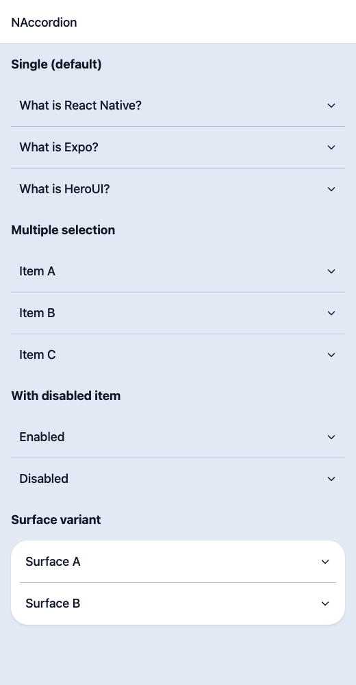
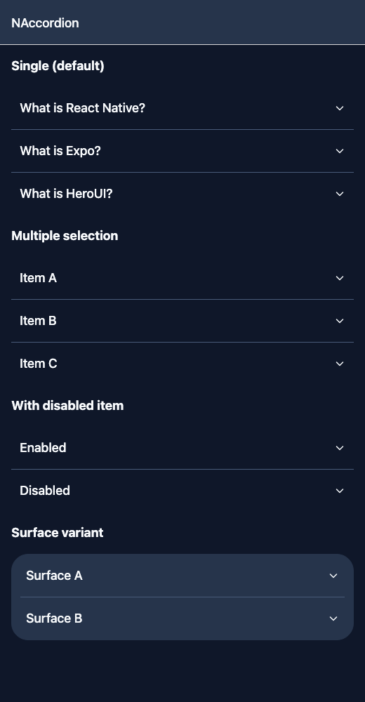
React Native components render to native views, so this is the component running in the example app, in the theme you are reading in.
9:41
Accordion.tsx
import { View } from 'react-native';import { NAccordion, NText } from '@nayan-ui/native';export default function AccordionScreen() {return (<View className="p-4 gap-4"><NText className="text-lg font-bold">Single (default)</NText><NAccordionitems={[{ title: 'What is React Native?', content: 'A framework for building native apps using React.' },{ title: 'What is Expo?', content: 'A set of tools for building React Native apps faster.' },{ title: 'What is HeroUI?', content: 'A component library for React Native.' }]}/><NText className="text-lg font-bold">Multiple selection</NText><NAccordionselectionMode="multiple"items={[{ title: 'Item A', content: 'Content A' },{ title: 'Item B', content: 'Content B' },{ title: 'Item C', content: 'Content C' }]}/><NText className="text-lg font-bold">With disabled item</NText><NAccordionitems={[{ title: 'Enabled', content: 'You can expand this.' },{ title: 'Disabled', content: 'Cannot expand.', isDisabled: true }]}/><NText className="text-lg font-bold">Surface variant</NText><NAccordionvariant="surface"items={[{ title: 'Surface A', content: 'Content in surface variant.' },{ title: 'Surface B', content: 'Another surface item.' }]}/></View>);}
| Name | Type | Default | Details |
|---|---|---|---|
| items | AccordionItemData[] | Required | Array of accordion items with id, title, content, and optional isDisabled. |
| selectionMode | 'single' | 'multiple' | 'single' | Whether single or multiple items can be expanded. |
| defaultValue | string | string[] | Optional | Default expanded item values. |
| variant | 'default' | 'surface' | Optional | Visual variant style. |
| hideSeparator | boolean | false | Whether to hide separators between items. |
| isCollapsible | boolean | false | Whether expanded items can be collapsed. |
| isDisabled | boolean | false | Whether the accordion is disabled. |
| className | string | ' ' | You can customise by passing tailwind classes. |
| itemClassName | string | ' ' | You can customise by passing tailwind classes. |
| titleClassName | string | ' ' | You can customise by passing tailwind classes. |
| contentClassName | string | ' ' | You can customise by passing tailwind classes. |
| type | 'single' | 'multiple' | 'single' | Alias of selectionMode. |
| disabled | boolean | false | Alias of isDisabled. |
Other components solving nearby problems.
- React Native Accordion
- React Native Collapsible
- React Native Expandable
- React Native Dropdown
- React Native Toggle Panel
- Mobile Accordion React Native
- React Native Accordion Tutorial
- React Native Accordion Component
- React Native Accordion Library
- React Native Collapsible Panel
- React Native Expandable List
- React Native FAQ Accordion
- Mobile Collapsible Component
- Cross Platform Accordion
- Expo Accordion Component
- React Native Accordion Animation
- React Native Accordion TypeScript
- Custom React Native Accordion
- React Native Accordion UI
- React Native Accordion Example