Input
An Input component allows users to enter text data. Built on top of heroui-native Input.
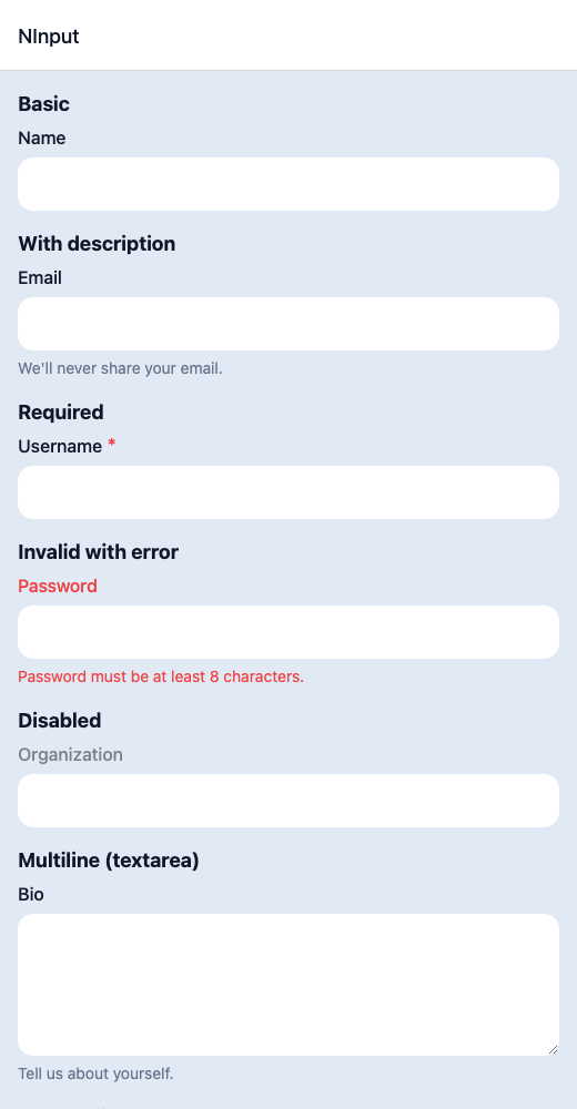
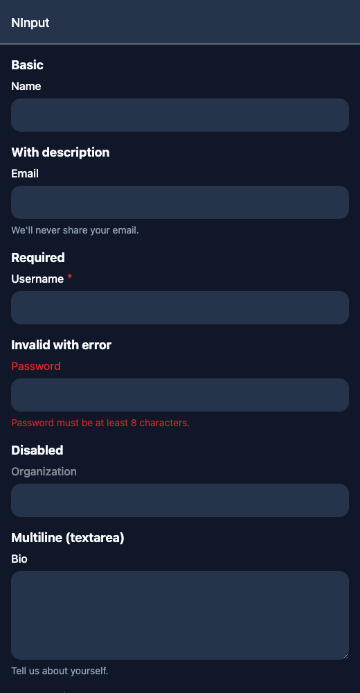
React Native components render to native views, so this is the component running in the example app, in the theme you are reading in.
9:41
Input.tsx
import { View } from 'react-native';import { NInput, NText } from '@nayan-ui/native';export default function InputScreen() {return (<View className="p-4 gap-1"><NText className="text-lg font-bold">Basic</NText><NInput label="Name" /><NText className="text-lg font-bold">With description</NText><NInput label="Email" description="We'll never share your email." /><NText className="text-lg font-bold">Required</NText><NInput label="Username" isRequired /><NText className="text-lg font-bold">Invalid with error</NText><NInput label="Password" isInvalid errorMessage="Password must be at least 8 characters." /><NText className="text-lg font-bold">Disabled</NText><NInput label="Organization" isDisabled /><NText className="text-lg font-bold">Multiline (textarea)</NText><NInput label="Bio" multiline description="Tell us about yourself." /><NText className="text-lg font-bold">All combined</NText><NInput label="Phone" description="Include country code." isRequired isInvalid errorMessage="Invalid phone number." /></View>);}
| Name | Type | Default | Details |
|---|---|---|---|
| label | string | Optional | Label for the input field. |
| description | string | Optional | Description text below the input. |
| errorMessage | string | Optional | Error message to display. |
| multiline | boolean | false | Whether to render as a multiline textarea. |
| isDisabled | boolean | false | Whether the input is disabled. |
| isRequired | boolean | false | Whether the input is required. |
| isInvalid | boolean | false | Whether the input is in an invalid state. |
| value | string | Optional | Controlled input value. |
| onChange | (value: string) => void | Optional | Callback when input value changes. |
| className | string | ' ' | You can customise input by passing tailwind classes. |
| containerClassName | string | ' ' | You can customise container by passing tailwind classes. |
| labelClassName | string | ' ' | You can customise label by passing tailwind classes. |
| descriptionClassName | string | ' ' | You can customise description by passing tailwind classes. |
| errorClassName | string | ' ' | You can customise error by passing tailwind classes. |
Other components solving nearby problems.
- React Native Input
- React Native TextInput
- React Native Form Input
- Mobile Input React Native
- React Native Input Component
- React Native Input Field
- React Native Text Field
- React Native Input Validation
- React Native Form Field
- React Native Input Mask
- React Native Password Input
- React Native Search Input
- React Native Numeric Input
- React Native Email Input
- Mobile Text Input
- Cross Platform Input
- Expo Input Component
- React Native Input Tutorial
- React Native Input TypeScript
- React Native Input UI